


Last updated: August 25, 2026
Power BI turns scattered spreadsheets, CRM exports, and departmental reports into one live, shared view of the business — and that shift is what actually improves decision-making, not the charts themselves. Data-driven organizations are dramatically more likely to win and keep customers than their peers, and studies have found that organizations deploying Power BI have seen returns of well over 300% across three years. The tool matters less than what it replaces: guesswork, stale spreadsheets, and decisions made three weeks after the moment that mattered.
Why Business Decisions Break Down Without the Right BI Tool
Most companies don’t have a data shortage. They have a data-trust problem.
Sales has one version of the numbers. Finance has another. Marketing is still waiting on last month’s export from the CRM team. By the time everyone agrees on what actually happened, the decision that depended on that information has already been made — on instinct, or made too late to matter.
The cost of this isn’t abstract. Poor data quality costs the average organization millions of dollars a year in wasted resources and missed opportunities, and losses of that scale recur annually, not as a one-time hit. At a national level, researchers have tied unreliable data to trillions of dollars in lost productivity and misdirected spending across the U.S. economy each year. Multiply that by every department making decisions on partial or outdated information, and “we’ll fix reporting eventually” starts to look like one of the more expensive sentences in business.
This is the gap Microsoft Power Platform services like Power BI are built to close — not by generating more data, but by giving everyone in the organization the same, current version of it.
What Power BI Actually Does
Power BI is Microsoft’s cloud-based business intelligence and data visualization platform. Strip away the marketing language and it does three things: it connects to the data sources a business already has (CRM, ERP, spreadsheets, cloud databases, financial systems), it models and cleans that data into something consistent, and it turns it into interactive dashboards and reports that update automatically as new data arrives.
That last part is the one that changes decision-making. A static spreadsheet answers the question you asked when you built it. A live Power BI dashboard keeps answering the question as the underlying numbers move — which is the difference between reacting to last quarter and adjusting course this week.
How Power BI Helps Businesses Make Better Decisions
Real-time reporting replaces stale spreadsheets
Traditional reporting cycles — pull the data, clean it in Excel, build the deck, present it two weeks later — mean decisions get made on information that’s already out of date. Power BI dashboards refresh on a schedule (often daily, sometimes near-instantly for connected data sources), so a sales leader looking at pipeline on Tuesday morning is looking at Tuesday morning’s numbers, not last month’s.
This matters most in fast-moving functions. Finance teams tracking cash flow, retail teams watching inventory turns, and operations teams monitoring supply chain exceptions all lose value in their data the longer it sits unrefreshed.
Self-service analytics removes the IT bottleneck
Before self-service BI became standard, getting a new report meant filing a request with IT and waiting. Power BI’s design philosophy borrows heavily from Excel’s familiarity, which is deliberate — a business analyst who already knows pivot tables can build a working dashboard without writing a line of code.
That accessibility has a compounding effect: when department leads can build and adjust their own views instead of waiting on a queue, questions get answered same-day instead of same-month, and BI teams shift from being report factories to being the group that governs data quality and answers harder questions.
AI-assisted analysis lowers the skill floor for good decisions
The biggest change to Power BI over the past two years hasn’t been a new chart type — it’s Copilot. Power BI’s built-in AI assistant lets users ask questions in plain English (“what’s driving the drop in Q3 renewals?”) and get back a generated visual, a narrative summary, and in many cases the underlying DAX formula, without anyone needing to know DAX at all.
For organizations that have historically had one or two people who “know how to build the real reports,” this is a meaningful shift. It doesn’t replace analytical judgment about which numbers matter — a report author still has to decide whether a metric is the right one to track — but it collapses the time between having a question and getting a first-pass answer, which is often the single biggest delay in decision-making.
Predictive analytics shifts decisions from reactive to proactive
Beyond describing what already happened, Power BI’s AI and machine learning integrations (forecasting visuals, anomaly detection, and Azure AI connections) let teams flag problems — an unusual dip in conversion, a supplier delay pattern — before they show up in a monthly report. That’s the practical difference between a BI tool that tells you what happened and one that helps you act before the quarter closes.
Real-World Impact: What the ROI Data Shows

The abstract case for BI is easy to make. The numbers back it up too. Organizations that treat decisions as data-driven rather than instinct-driven are measurably better at both winning and keeping customers than peers who don’t, with data-driven organizations found to be significantly more likely to acquire new customers and multiple times more likely to retain existing ones and operate profitably.
Power BI specifically has a well-documented return profile. Independent research has found organizations deploying it achieve substantial multi-year returns with a payback period of under six months in many cases, according to a Forrester study cited in industry benchmarking of Power BI dashboard deployments. Consulting engagements built around Power BI implementations commonly report cutting reporting cycles by close to half or more and materially reducing the time analysts spend on manual data preparation, freeing that time for actual analysis rather than data wrangling.
None of this is unique to any one vendor’s marketing. It’s the pattern with mature BI adoption generally — the market itself reflects it, with global business intelligence software spending projected to grow from roughly $39.79 billion in 2026 toward $121.56 billion by 2034 as more organizations formalize data-driven decision-making as a core operating discipline rather than a side project for the analytics team.
Power BI vs. Other BI Platforms: Where It Wins
Power BI isn’t the only serious BI platform, and it isn’t the best fit for every organization. The honest comparison usually comes down to ecosystem and audience rather than raw feature count.
Power BI tends to win when an organization is already standardized on Microsoft 365, needs to deploy BI cost-effectively to a large non-technical user base, and cares most about operational reporting and performance dashboards rather than the deepest possible data-storytelling or exploratory-analysis capabilities that platforms like Tableau and Qlik are built around. Tableau generally has the edge in pure visualization depth and client-facing data storytelling. Qlik’s associative model is stronger for teams doing heavy exploratory analysis across complex, multi-source data.
For most mid-market and enterprise organizations already running Microsoft tools — Excel, Teams, Azure, Dynamics — Power BI’s native integration with that stack tends to outweigh the visualization gap, especially once Copilot and Fabric are factored into total cost of ownership.
Where Power BI Falls Short Without the Right Setup
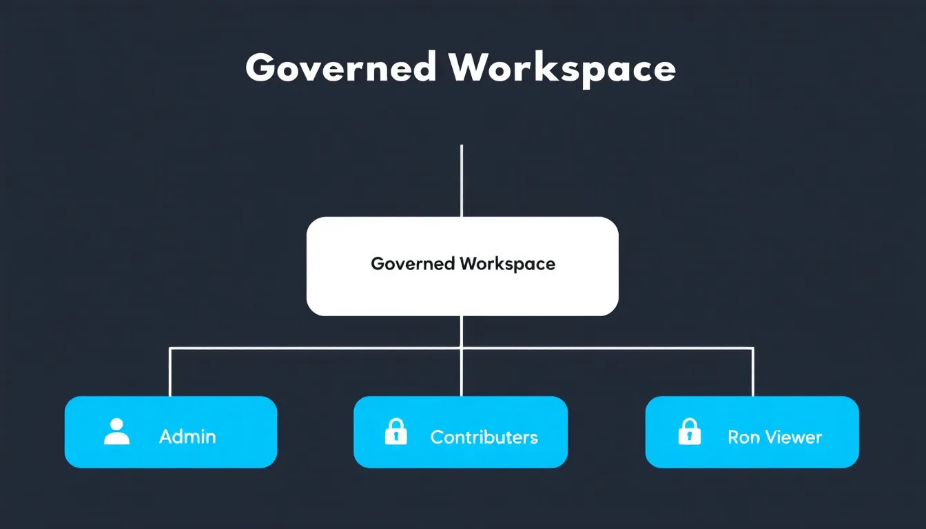
It’s worth being direct about this, because a lot of BI content isn’t: Power BI’s flexibility is also its biggest governance risk.
Because it’s easy for business users to publish their own reports, organizations without a governance plan tend to end up with duplicate dashboards, inconsistent metric definitions, and permission sprawl across dozens of workspaces — a pattern common enough that managing access, monitoring usage, and organizing content consistently is one of the most frequently cited challenges among organizations running Power BI at scale. Security management in particular is handled at multiple levels rather than through one central control point, which can slow deployments down if it isn’t planned for early.
None of this is a reason to avoid the platform — it’s a reason to treat governance as part of the implementation, not an afterthought. Row-level security, a clear workspace structure, and defined data ownership solve most of these problems, but they have to be designed in from the start.
Getting the Full Value: Implementation Best Practices
The organizations that get the most out of Power BI tend to do a few things consistently:
Start with a governance plan, not just a dashboard. Decide who owns which datasets, who can publish to which workspaces, and how row-level security will control what different roles see, before rollout — not after the second duplicate report shows up.
Invest in the data model before the visuals. A clean, well-structured semantic model makes every report built on top of it faster and more trustworthy. Skipping this step is the most common reason Power BI deployments underperform.
Train beyond the BI team. The self-service value only materializes if business users actually know how to build and interpret reports, not just view them.
Plan licensing around usage, not headcount. With Power BI Pro priced at roughly $14 per user per month and Premium Per User around $24, larger organizations often reach a break-even point where Microsoft Fabric capacity licensing becomes more cost-effective than per-user licenses, a threshold that shows up once the number of report viewers climbs into the hundreds.
Treat Fabric as the natural next step, not a separate project. For organizations scaling past basic dashboards, Microsoft Fabric unifies the data integration layer that Power BI reports draw from, which is where a lot of the governance and performance problems above actually get solved.
The Bottom Line
Power BI doesn’t make decisions for a business. What it does is remove the excuses for making decisions on bad information — the two-week-old spreadsheet, the report nobody trusts, the number that means something different in three different departments. Get the governance and data modeling right, and the payoff isn’t a nicer dashboard. It’s a business that reacts to what’s actually happening instead of what happened last month.
If your team is weighing a Power BI rollout, or already has one that’s outgrown its original setup, our case studies walk through how we’ve approached this for organizations across finance, healthcare, and retail — or you can talk to our team directly about what a governed, scalable Power BI implementation would look like for your data.
Frequently Asked Questions
What is Power BI used for in business intelligence?
Power BI connects to a business’s existing data sources — CRM systems, ERP platforms, spreadsheets, financial systems — and turns that data into interactive dashboards and reports that update automatically. It’s used for performance tracking, financial reporting, sales analytics, and operational monitoring across nearly every industry.
How does Power BI improve decision-making?
It replaces stale, manually-built reports with live dashboards that reflect current data, gives non-technical users the ability to build and adjust their own reports without waiting on IT, and uses AI (Copilot) to surface trends, anomalies, and answers to plain-English questions in seconds rather than days.
Is Power BI worth it for small businesses?
Often, yes. Power BI Desktop is free, and Pro licensing is priced per user rather than requiring large upfront infrastructure investment, which makes it accessible for smaller teams that need to consolidate data from tools like QuickBooks, a CRM, and Google Analytics into one view without hiring a dedicated analytics team.
What’s the difference between Power BI and traditional spreadsheet reporting?
Traditional spreadsheet reports are static snapshots that go stale the moment they’re built. Power BI dashboards connect directly to live data sources and refresh automatically, so the report a decision-maker is looking at reflects current conditions rather than a point-in-time export.
How much does Power BI cost in 2026?
As of 2026, Power BI Pro is priced at roughly $14 per user per month and Premium Per User at roughly $24 per user per month, both billed annually. Larger organizations often move to Microsoft Fabric capacity-based pricing, which starts at a fixed monthly cost regardless of user count and becomes more economical once viewer counts scale into the hundreds.